Calendar Basics
Google Calendar Logo History: The Actual Evolution From 2006 to 2026
By LifeLoad · May 31, 2026
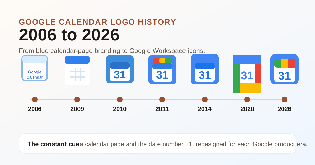
Quick answer: the Google Calendar logo evolved from early blue calendar-page branding in 2006, through several Google Apps and Material Design-era blue icons, into the four-color Google Workspace icon in 2020. In May 2026, Google began rolling out a fresh Workspace icon identity, so some people still see the 2020 icon while others see the newer 2026 version.
Last reviewed on June 4, 2026.
The images below are simplified editorial references for comparing the major eras. They are not official Google brand assets.
Google Calendar logo evolution at a glance
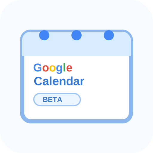
Beta-era web product mark
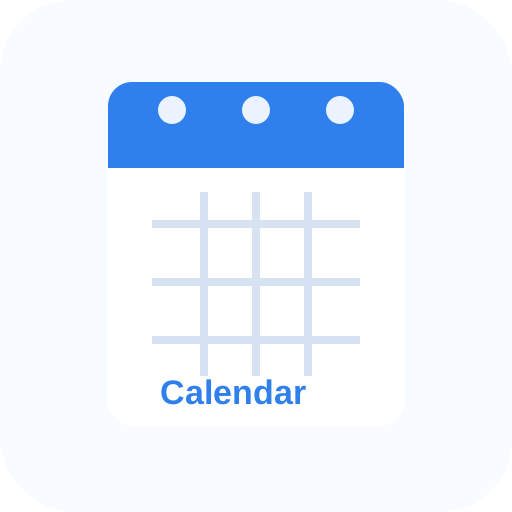
Cleaner page icon
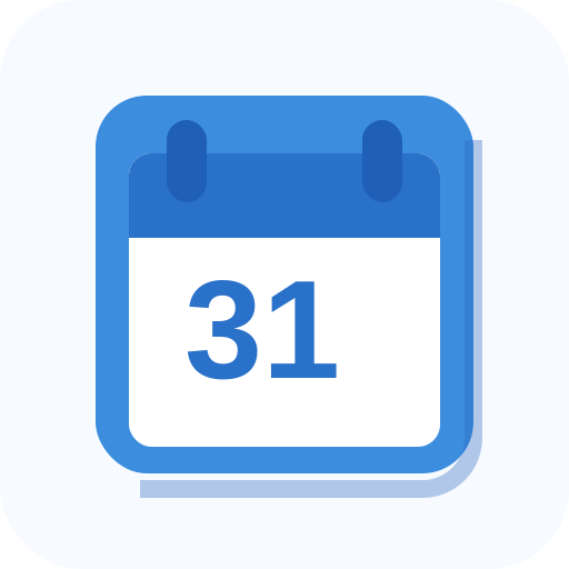
App-style blue calendar
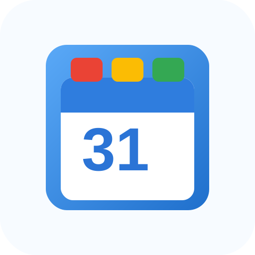
Refined Google Apps icon
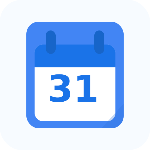
Material Design blue icon
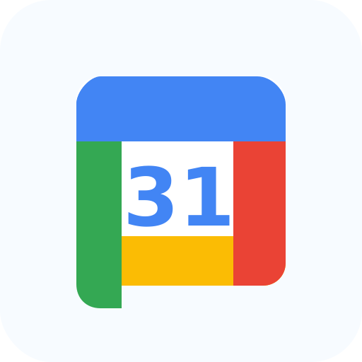
Workspace four-color icon
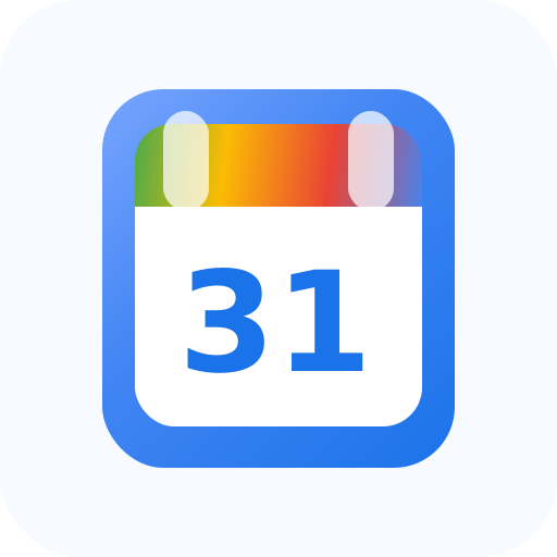
Workspace icon refresh
| Era | Main visual change | What to notice |
|---|---|---|
| 2006-2009 | Early Google Calendar web branding | More like a product label than a mobile app icon |
| 2009-2010 | Simpler calendar-page treatment | Blue page styling becomes the dominant cue |
| 2010-2013 | More app-like icon | Calendar starts feeling like part of a suite |
| 2011-2014 | Refined Google Apps identity | More polished blue icon with stronger date emphasis |
| 2014-2020 | Material Design blue icon | Flat shape, clean 31, and stronger mobile-app readability |
| 2020-2026 | Google Workspace icon | Four Google colors replace the old mostly-blue look |
| 2026-present | New Workspace visual refresh | Google begins moving Calendar into a newer icon system |
2006-2009: the beta-era Google Calendar logo
Google Calendar launched in April 2006, and its earliest branding looked like a web product from that era: a Google wordmark, a blue calendar-page idea, and a practical “this is a calendar” visual cue.
The old Google Calendar logo was not trying to be a tiny app-store tile. It lived in browser tabs, product pages, and web UI. That is why the earliest marks feel more like labels than icons.
2009-2010: the cleaner calendar page
The next visible step was a cleaner blue-and-white calendar page. This is where the product identity starts to center on the object itself: a small calendar sheet with a blue header.
For searchers looking for the “old Google Calendar logo,” this era matters because the blue page idea became the foundation for several later versions.
2010-2013: a more app-like Calendar icon
By 2010, Google Calendar’s icon felt more like an application icon and less like a web-page label. The blue square/page shape became stronger, and the date number became a clearer part of the mark.
This is also the period when Google Calendar was becoming part of a larger daily workflow: Gmail, Docs, Calendar, and the broader Google Apps suite were being used together more often.
2011-2014: the refined Google Apps-era logo
The 2011-2014 version kept the blue calendar concept but polished the shape, shading, and date treatment. Compared with the earlier versions, it looked more intentional as a product-suite icon.
Google also highlighted Calendar’s date behavior around this period. In 2011, Google wrote about Calendar’s birthday and noted a new favicon that could show the current day, reinforcing the date-number idea users still associate with Calendar.
2014-2020: the blue Material Design Google Calendar icon
The 2014-2020 Google Calendar icon is the one many people remember as the classic old blue Calendar logo. It used a flatter Material Design style, a bold blue shape, and a clean “31” in the center.
This version was easy to recognize at small sizes because it had one dominant color and one obvious number. It also looked different from Gmail, Drive, Docs, and other Google apps at a glance.
2020-2026: the Google Workspace four-color icon
In October 2020, Google introduced Google Workspace and moved its productivity apps into a more unified visual system. Calendar changed from a mostly-blue icon to the four-color Workspace style.
This 2020 Google Calendar logo kept the “31” but surrounded it with Google’s blue, red, yellow, and green. The tradeoff was clear: it matched the Workspace family better, but some users felt the apps became harder to distinguish quickly because several icons now shared the same color language.
2026-present: the current Google Calendar logo rollout
Google announced a fresh visual identity for Workspace app icons in May 2026, with rollout starting May 19, 2026. That means the current Google Calendar logo is in transition: some devices and surfaces may show the newer icon while older screenshots, cached assets, app shortcuts, or documentation still show the 2020 version.
This kind of mismatch is normal during a staged rollout.
Why your Google Calendar icon may not match screenshots
Google’s May 2026 Workspace update is rolling out across products and platforms. That means the icon can update in one place before another:
- Workspace app launcher
- Browser favicon
- Mobile app icon
- Play Store or App Store listing
- Pinned shortcuts
- Internal documentation screenshots
Mixed icon states are normal during a rollout.
Which Google Calendar logo should you use?
Use the current icon from Google’s official app, help center, or brand resources when you are writing public documentation. Do not copy a random SVG from the web into a product, ad, or landing page.
For personal shortcuts, launchers, or icon packs, people often use old icons for nostalgia. That is different from using Google’s logo in public branding.
Practical notes for designers and writers
If you are writing a tutorial, the most useful phrasing is usually:
- “Open Google Calendar” instead of “click the blue Calendar icon.”
- “Look for the Calendar app with the 31” when screenshots vary.
- “Your icon may look different during Google’s 2026 Workspace icon rollout.”
That keeps the instruction accurate even when the icon changes across devices.
Sources
- Logopedia: Google Calendar logo history
- Google Blog: original Google Calendar launch
- Gmail Blog: five years of Google Calendar
- Google Workspace introduction and 2020 identity context
- Google Workspace Updates: fresh visual identity for Workspace app icons
- Google Calendar on a computer
Bottom line
The Google Calendar logo history has three big phases: early blue calendar-page branding, the clean blue app-icon era, and the Google Workspace era. If your Google Calendar icon looks different from someone else’s in June 2026, it is probably rollout timing, not an error. Look for the Calendar name and the 31 cue, and use official Google sources for any public-facing logo reference.
Frequently asked questions
- What does the Google Calendar logo look like now?
- As of Google's 2026 Workspace icon refresh, many users are seeing a newer Calendar icon during rollout. Some app surfaces, screenshots, and shortcuts may still show the 2020 multicolor 31 icon.
- Why did Google change the Calendar icon?
- Google has changed the Calendar icon as its product design system changed: early web branding, Google Apps and Material Design-era blue icons, the 2020 Workspace rebrand, and the 2026 Workspace visual refresh.
- What was the old Google Calendar logo?
- The old Google Calendar logo usually refers to the blue calendar-page icon used before the 2020 Workspace rebrand, especially the 2014-2020 Material Design version.
- Why do the Google Calendar and Gmail icons look so similar?
- The 2020 Workspace icons shared Google's four-color outline language, so Gmail, Calendar, Drive, Docs, and Meet had related shapes and palettes. The 2026 refresh gives the Workspace icons a different look again.
- Can I get the old blue Calendar icon back?
- You may be able to use custom launchers, icon packs, or iOS Shortcuts for personal shortcuts, but you should not use unofficial Google logos for branding, marketing, or public materials.
Calendar Basics